2019 Branding


Arkansas State Marketing department

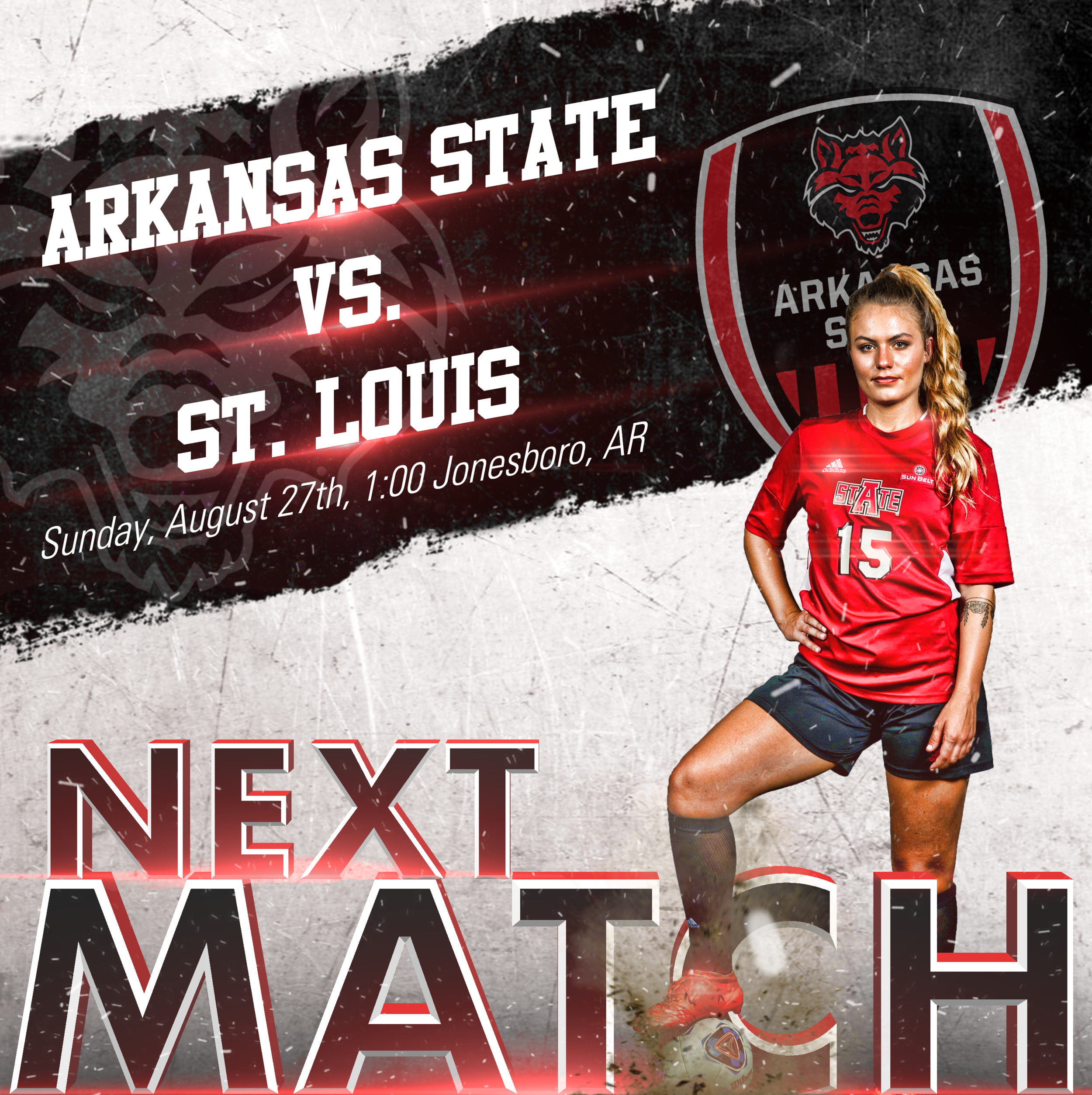
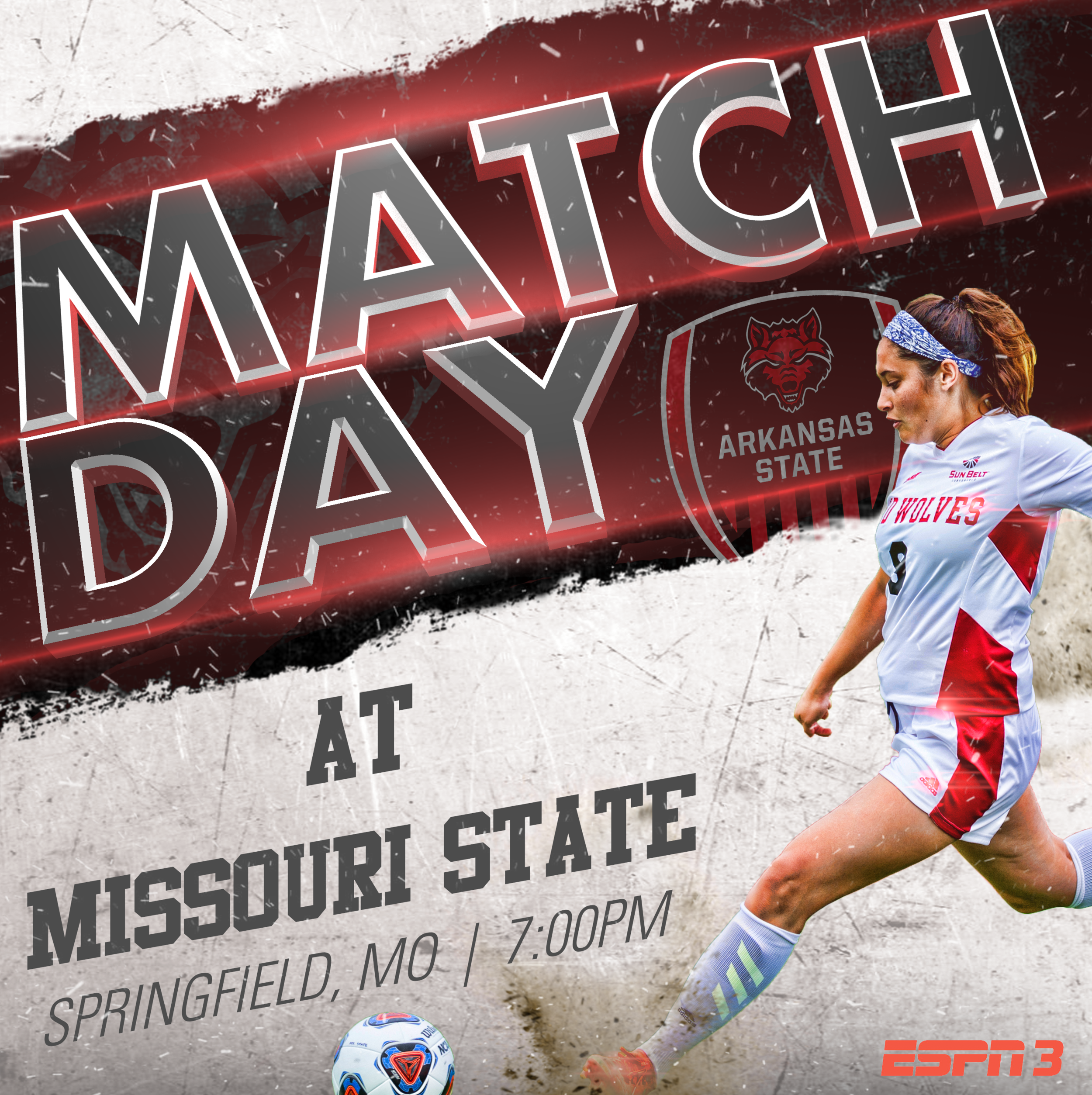
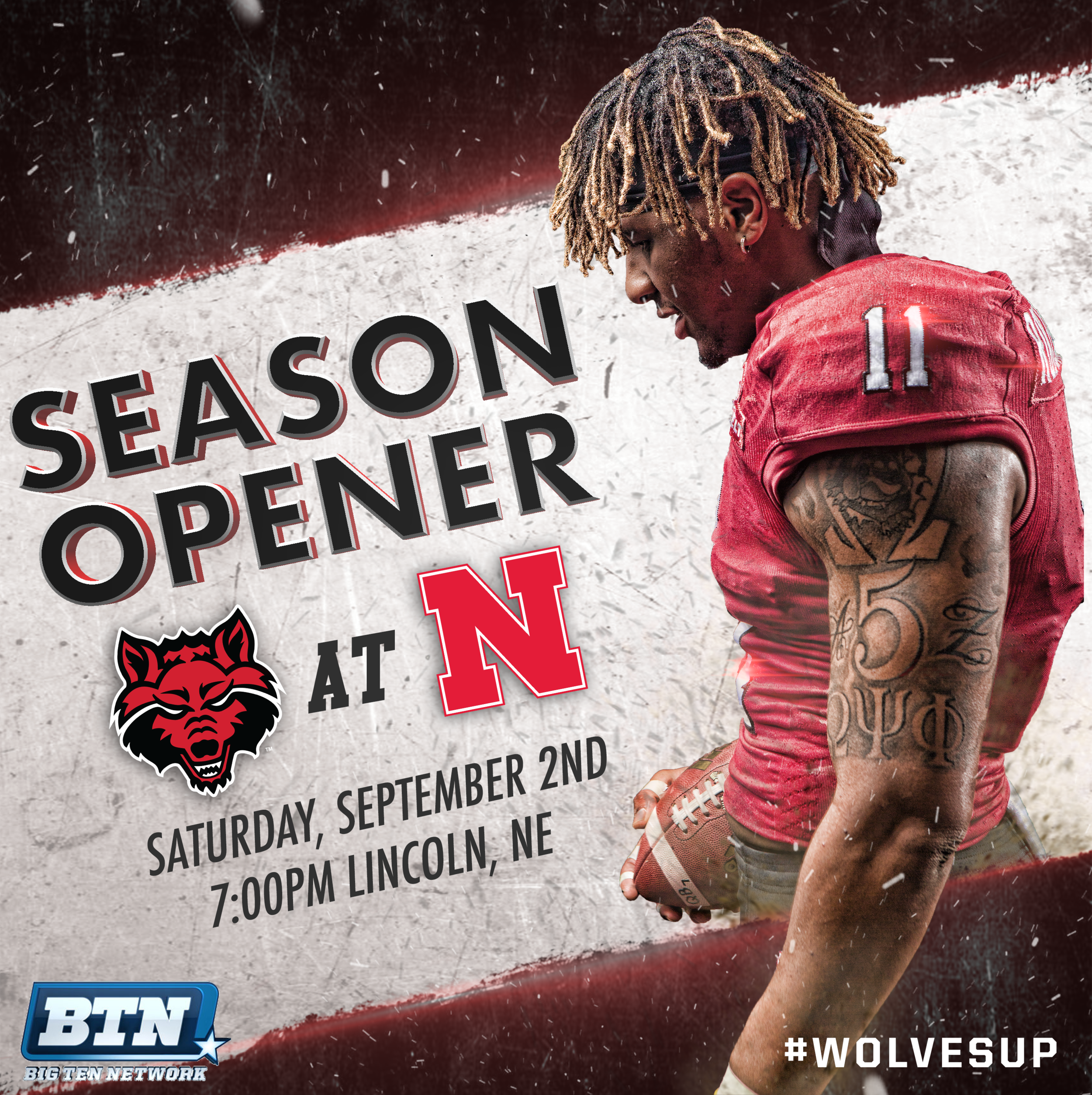
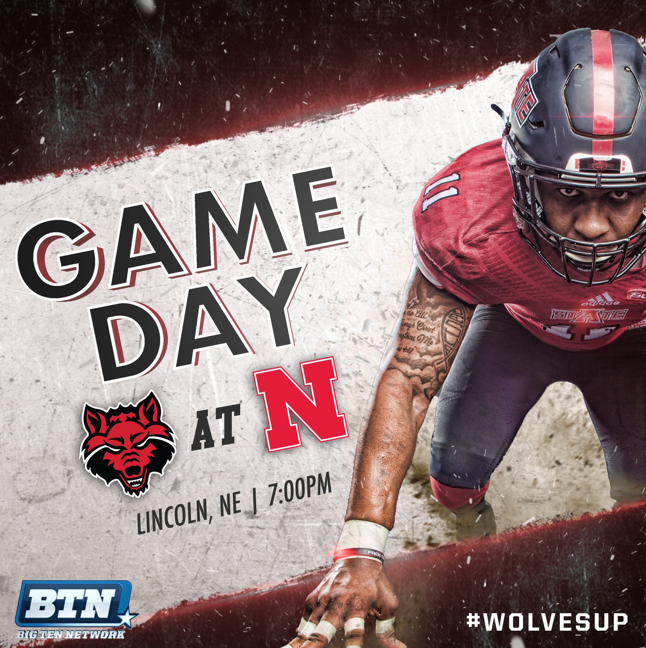
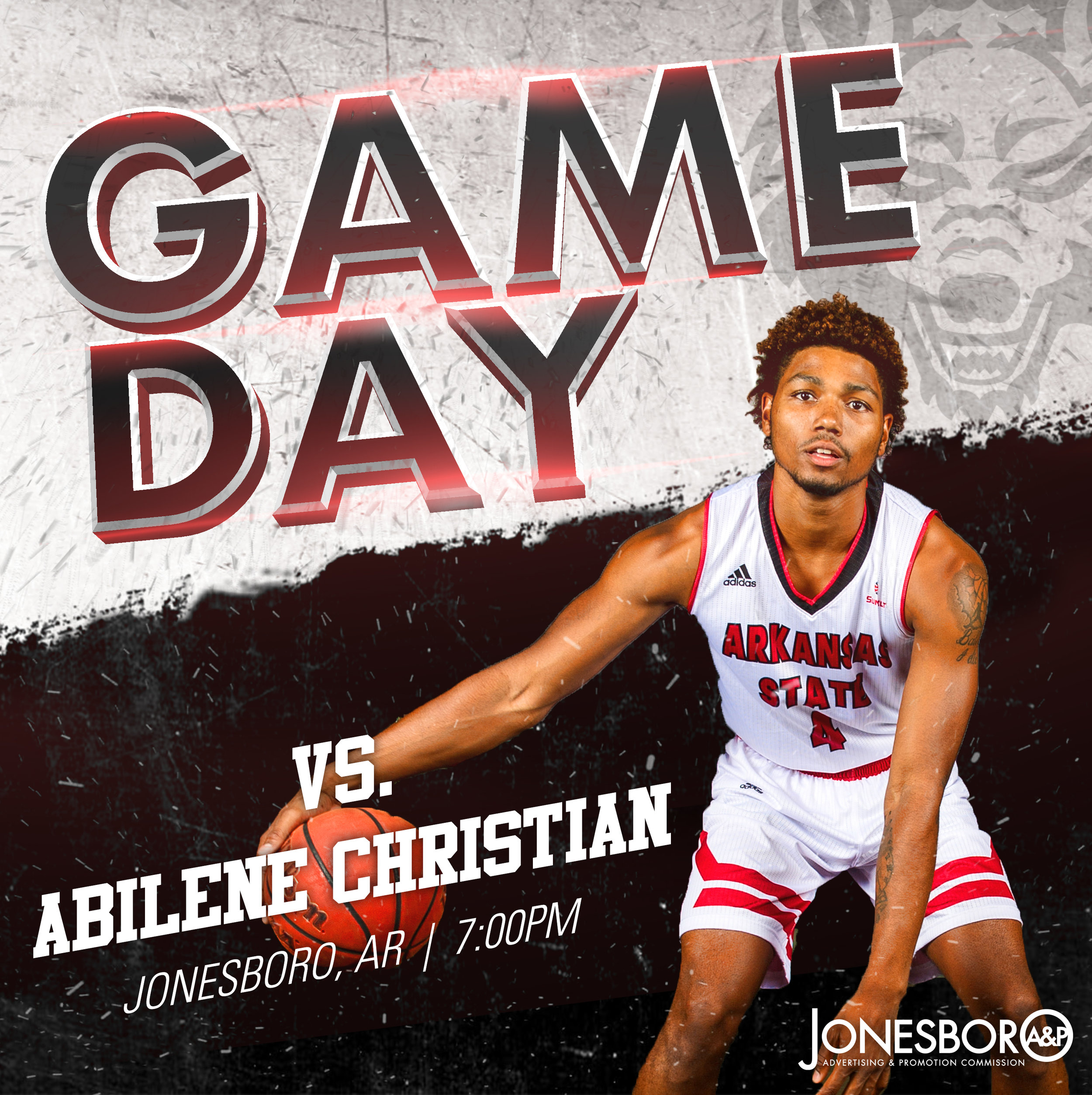
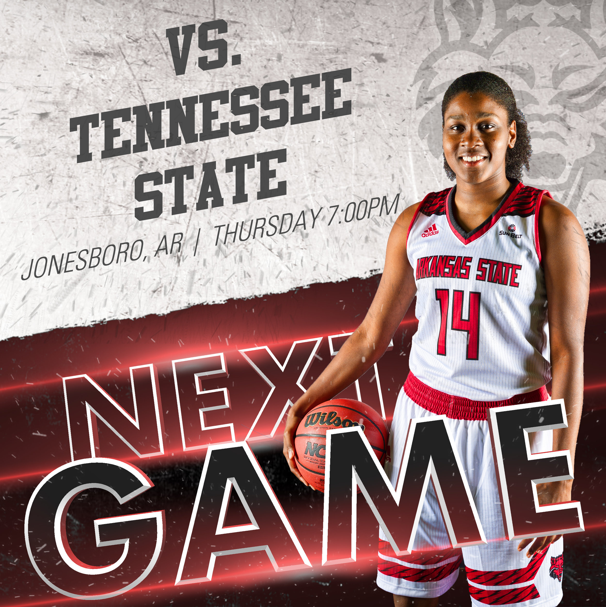
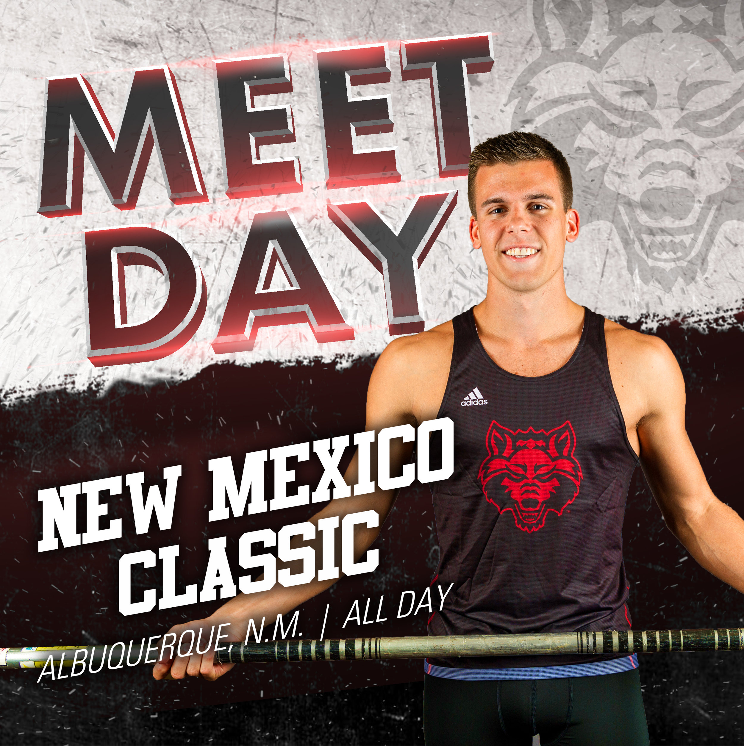
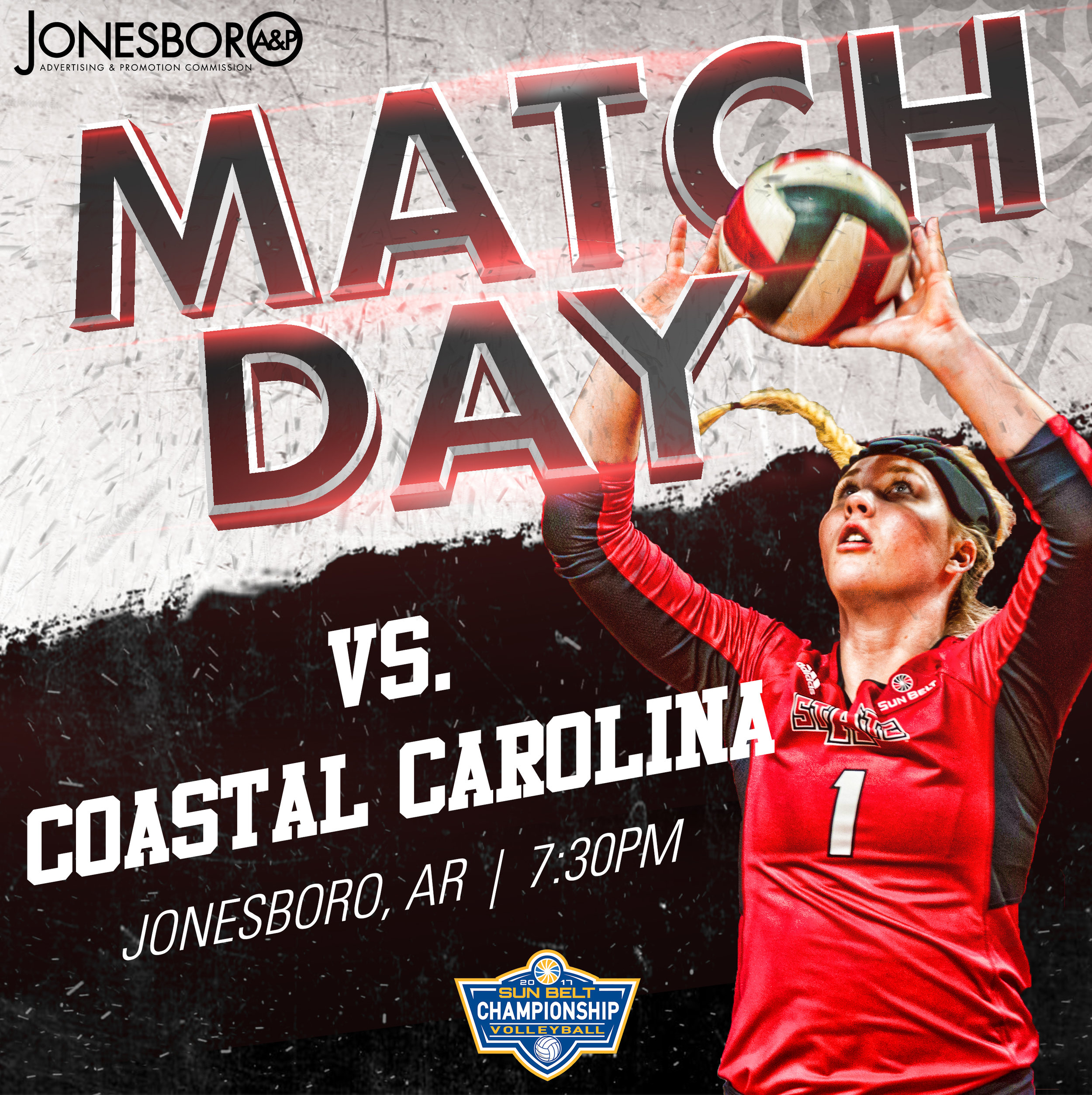
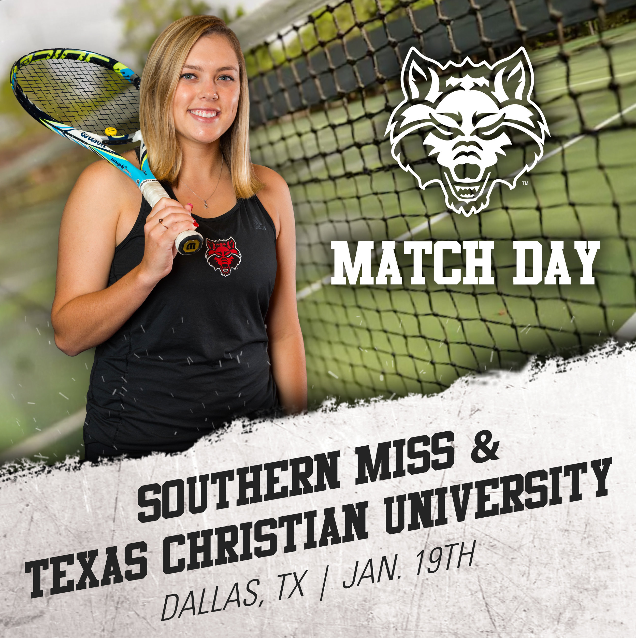
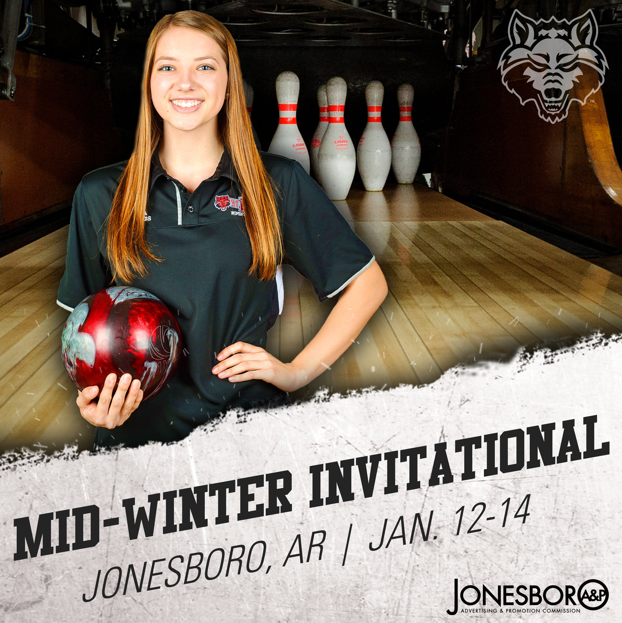
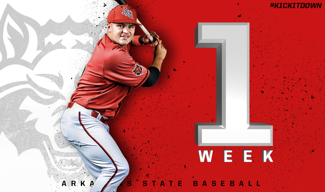
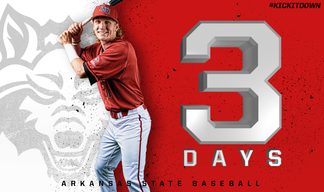
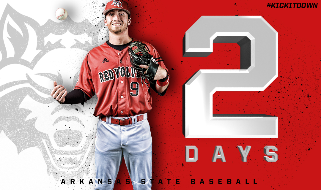
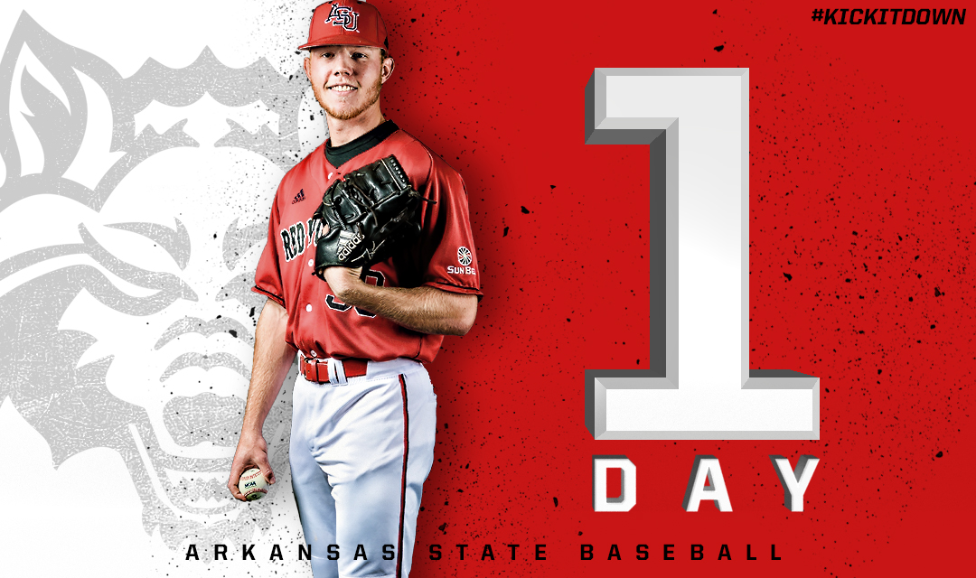
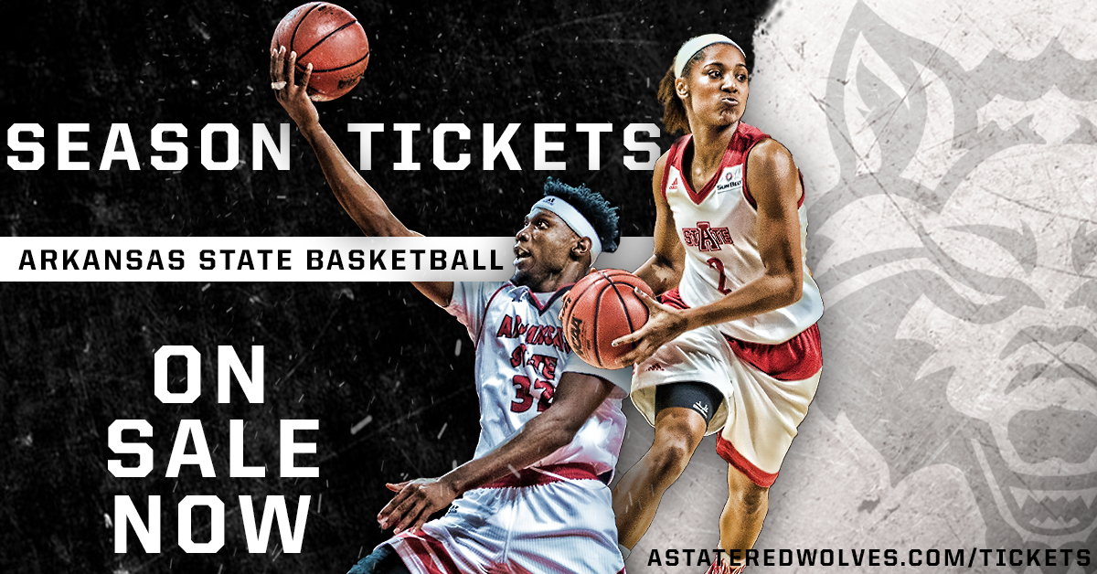
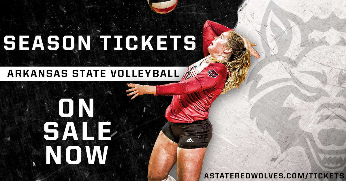
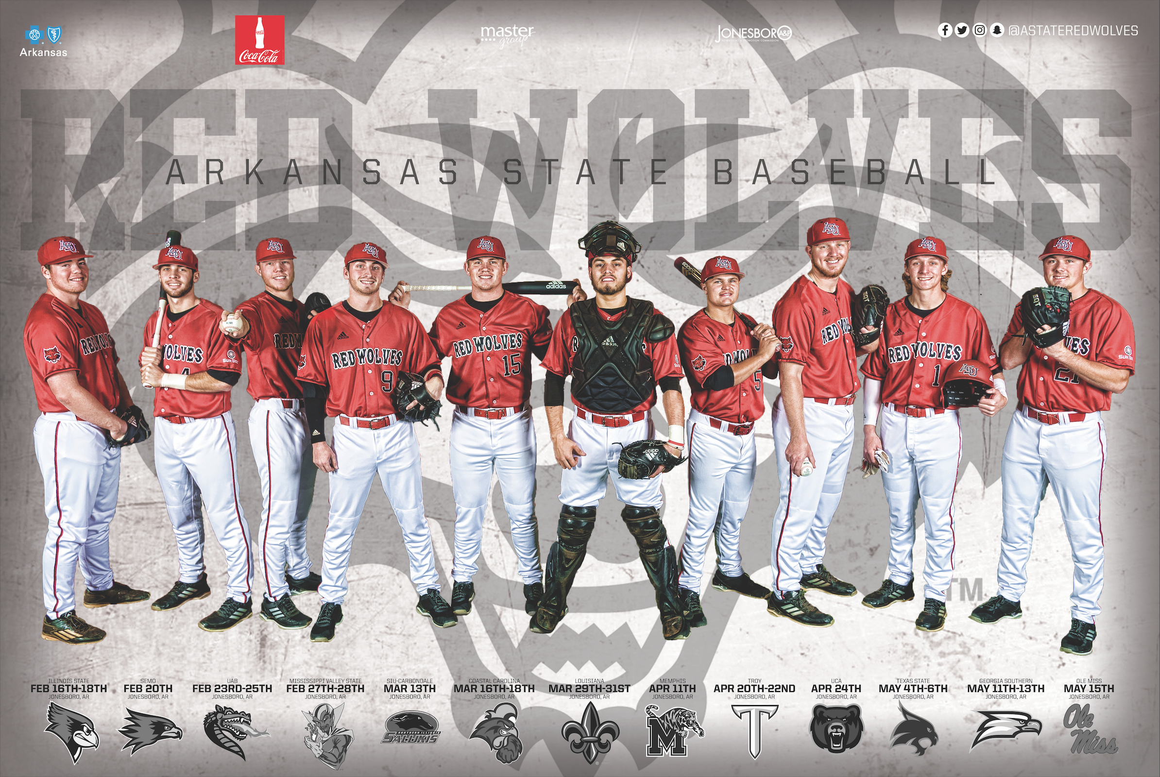
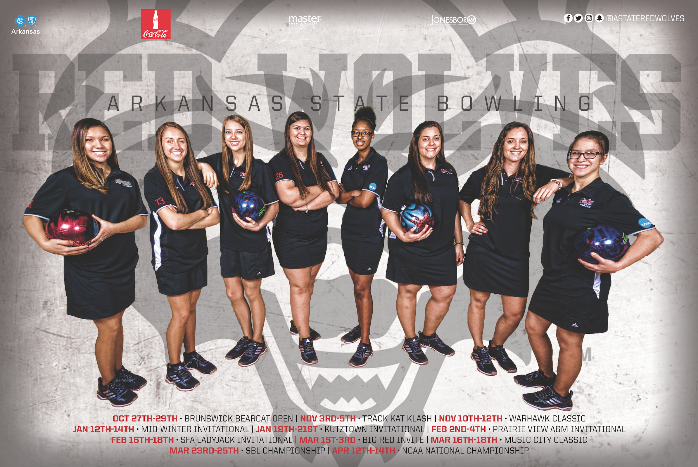
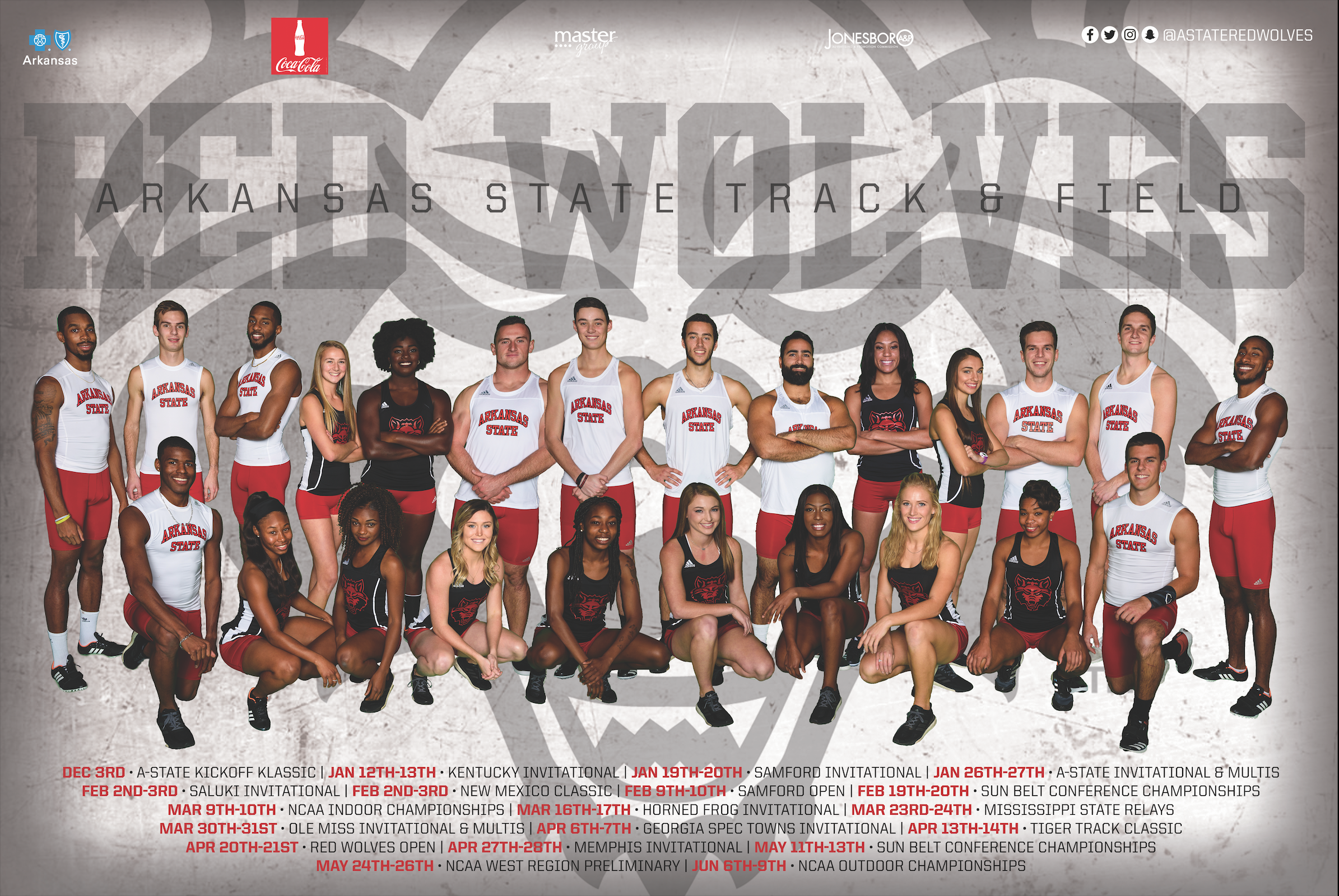
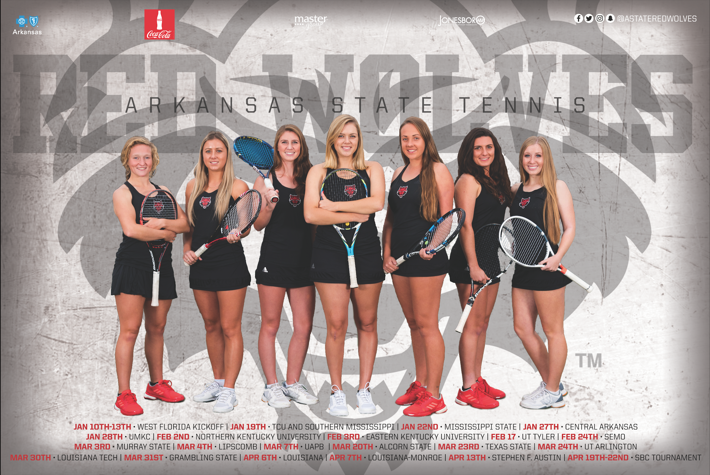
I was beyond fortunate to obtain a Student Graphic Design position with the Arkansas State Marketing Department, but even more fortunate for all the people I met along the way. This job gave me the opportunity and experience of creating visuals for tons of ASU's Athletics promotions, social media game days, schedule posters, rack cards, video boards, billboards and more! Coming in every day with a new agenda on the schedule, sending proofs back and forth, while working to deliver a product to meet everyones needs was always a new challenge I was up to! This position taught me much about communicating with my marketing bosses, Dani Smith and Garret Dellwo to deliver a product that was executed to be visually successful to the public. I can't thank this team enough for everything they did for me to help me grow.

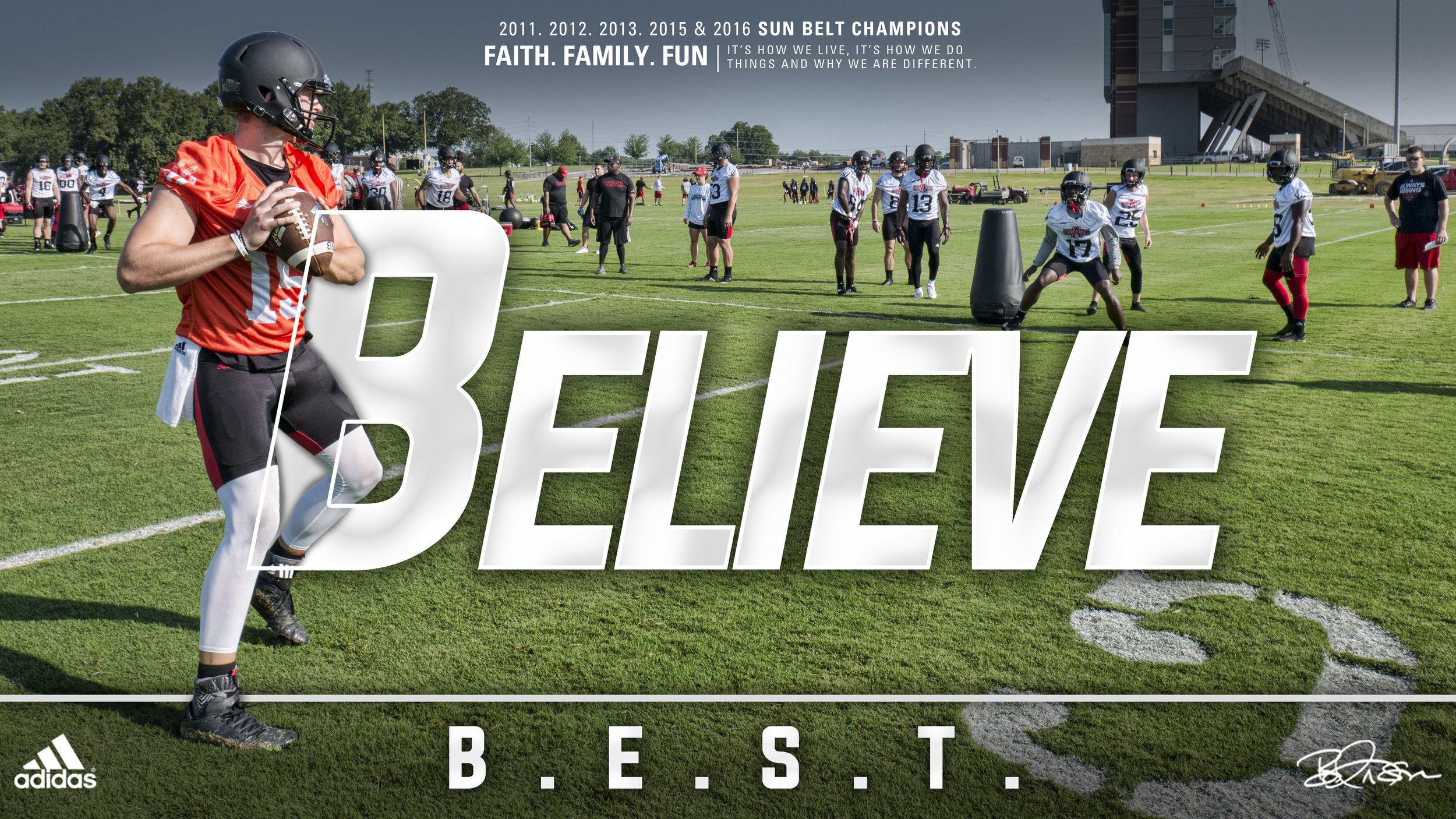
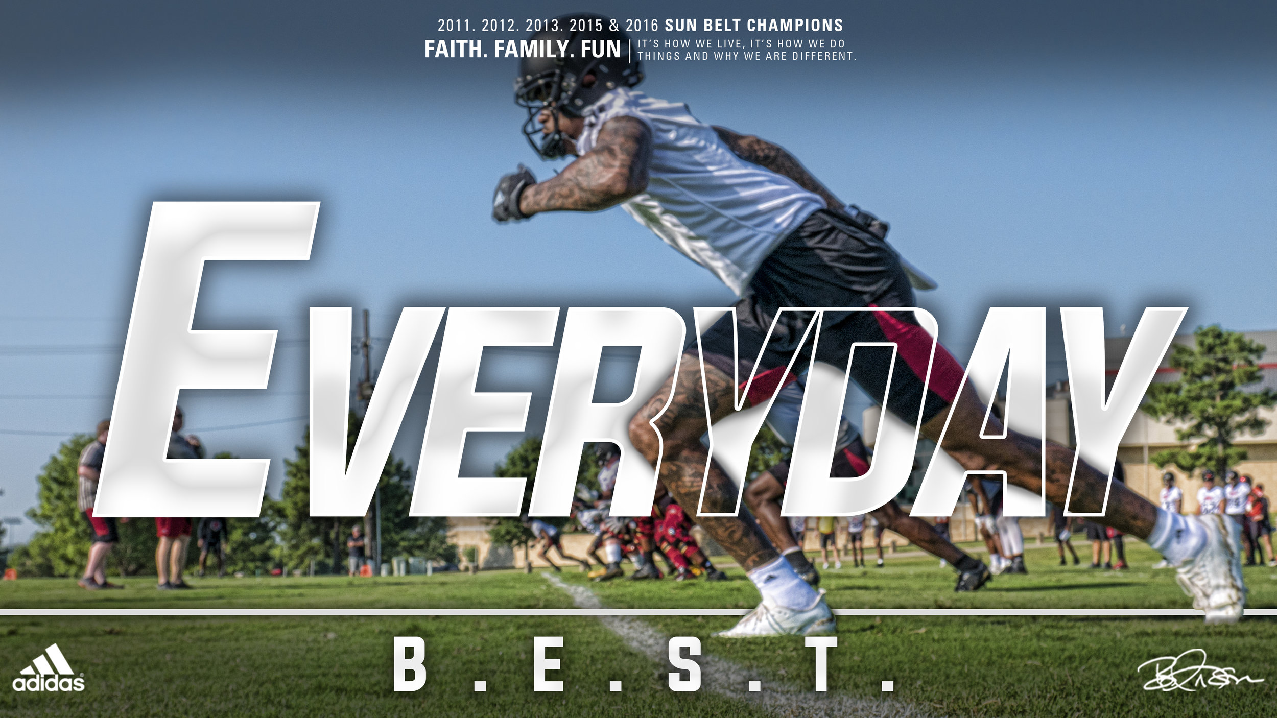
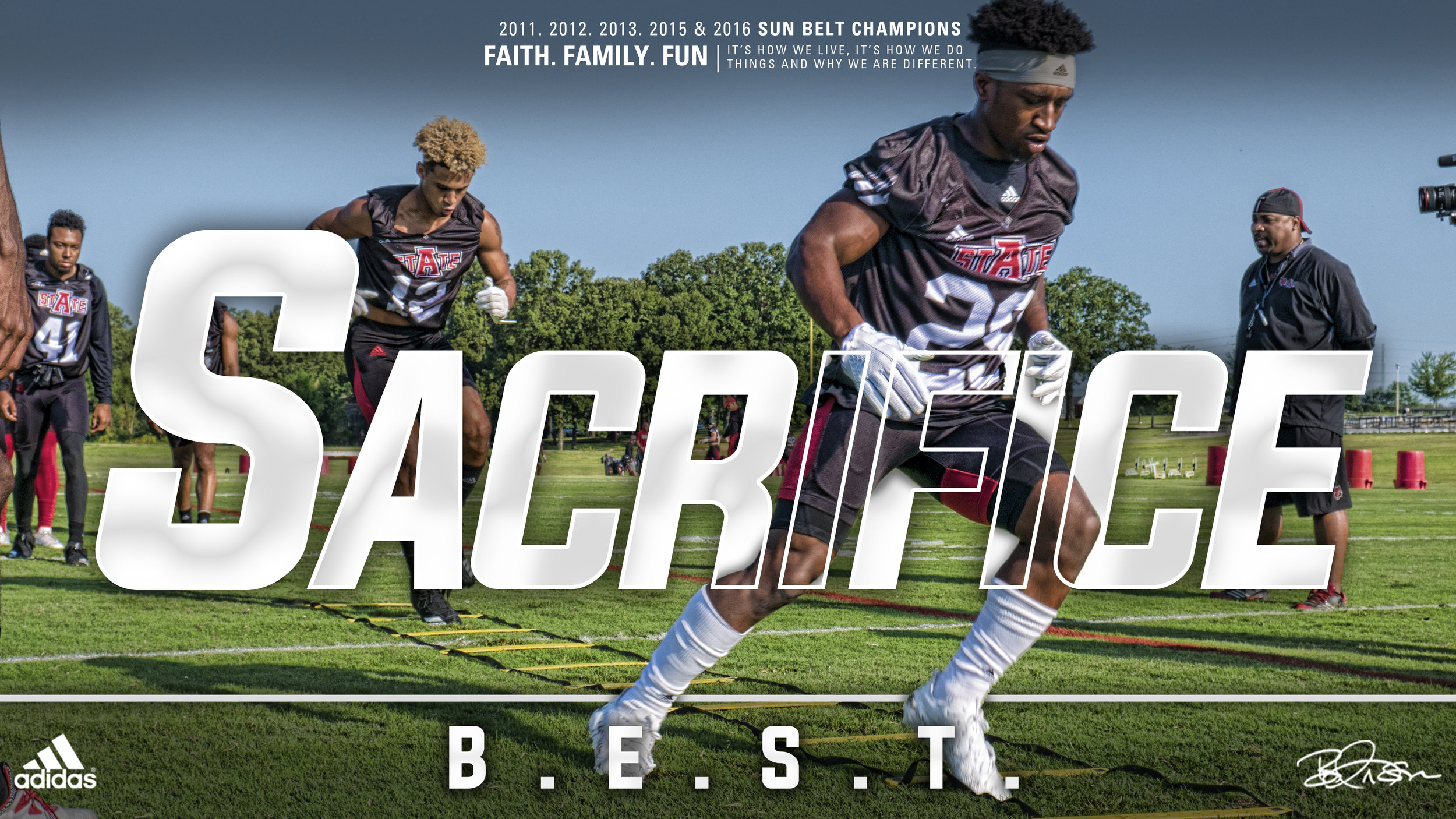
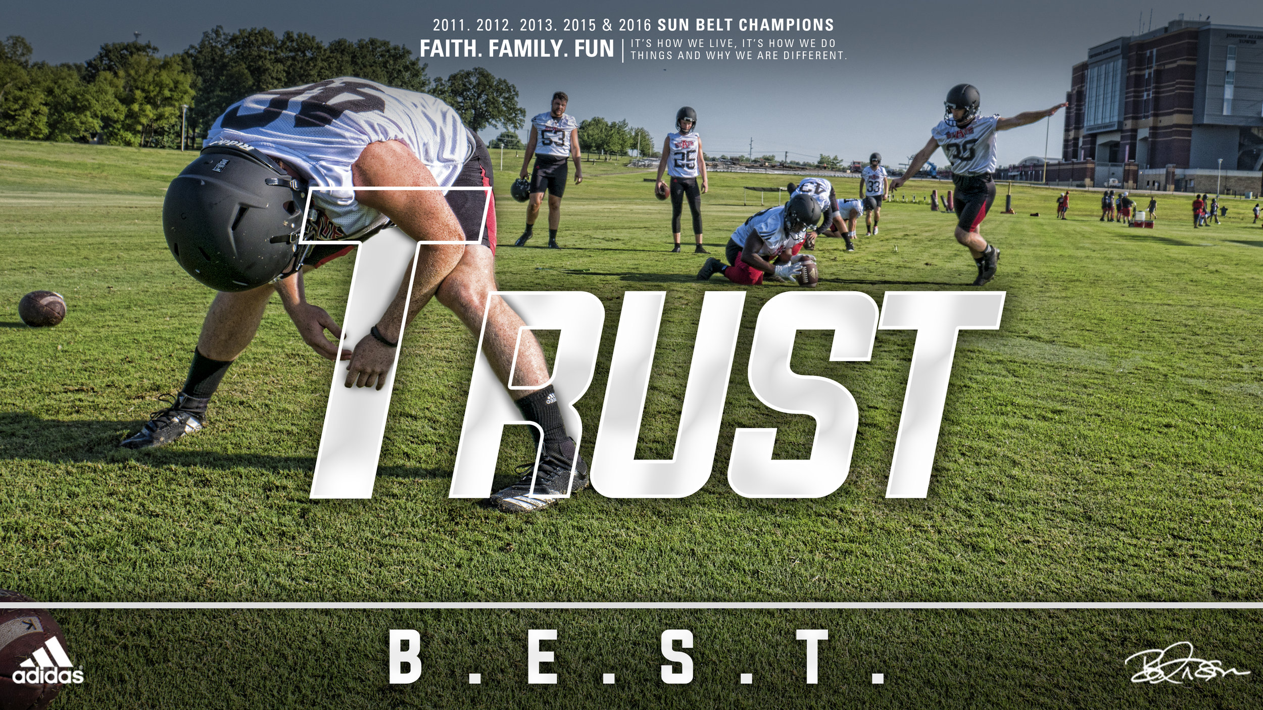
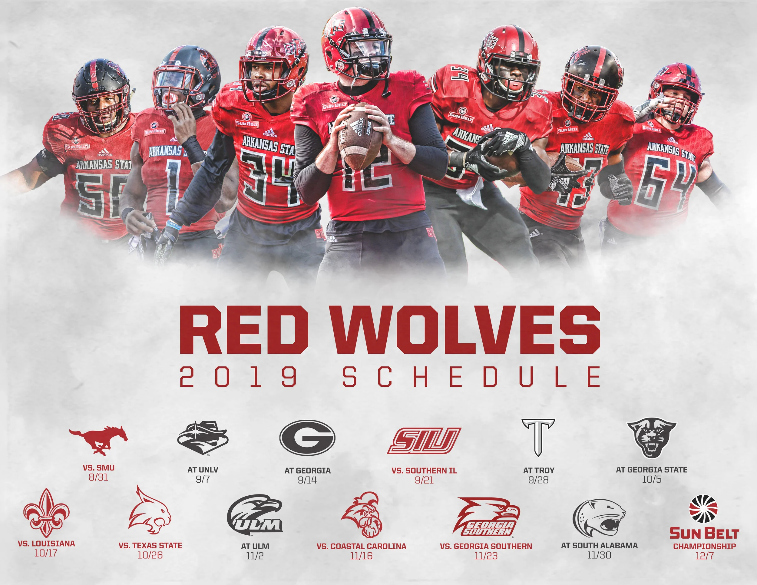
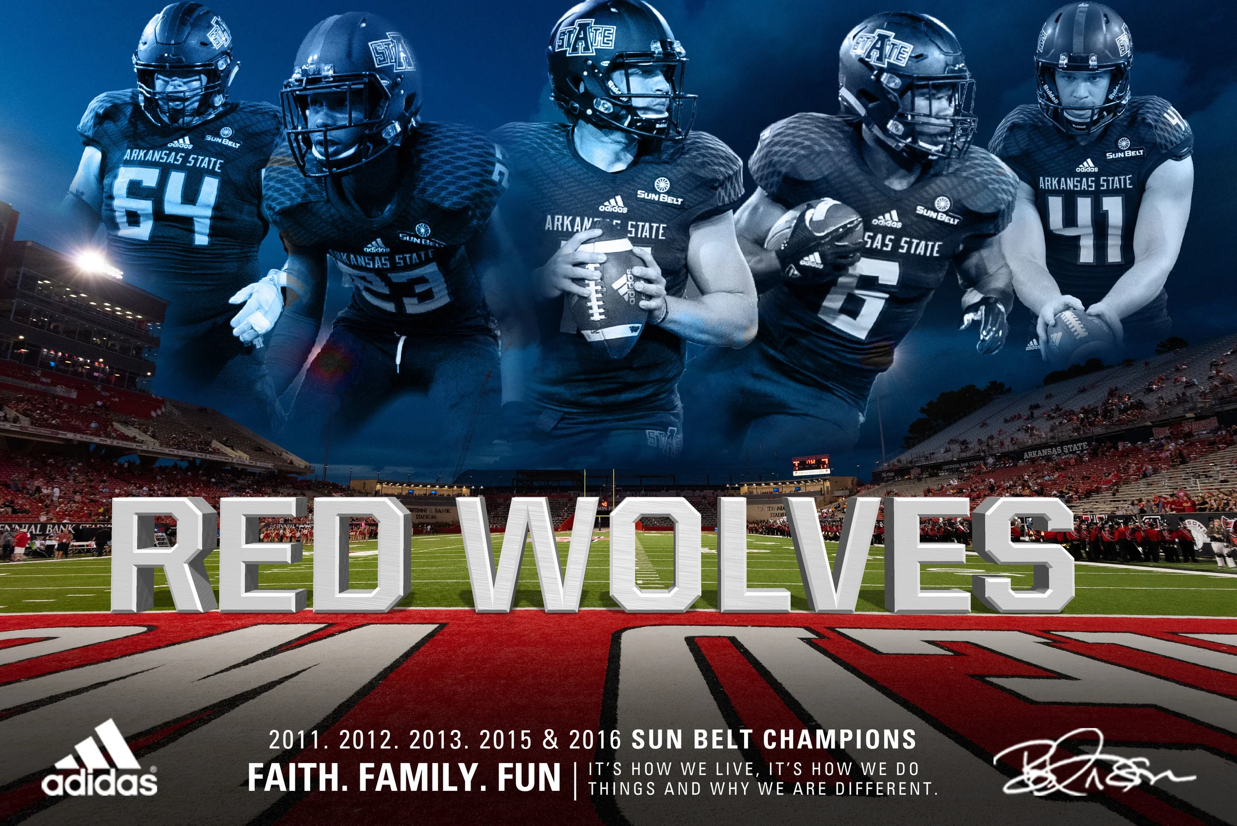
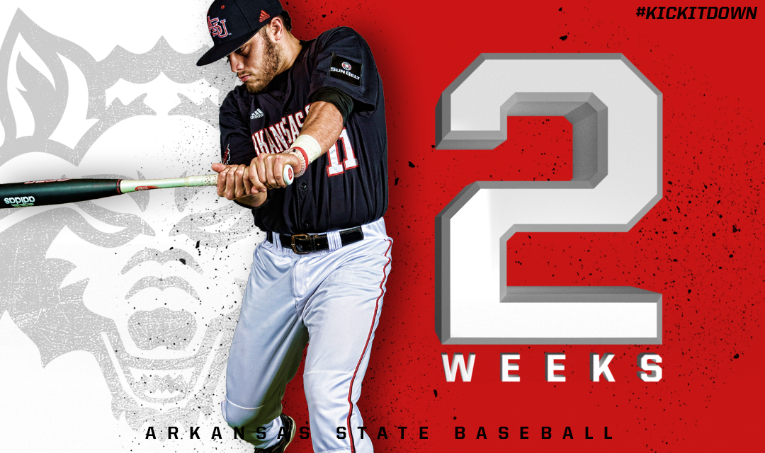
Arkansas State Football
After working for Arkansas State Marketing Department for several months, I graduated. After graduation, I was offered a full time position over at Arkansas State Football. This is where I currently work now. Some of the work I've done at both positions are portrayed on this page.


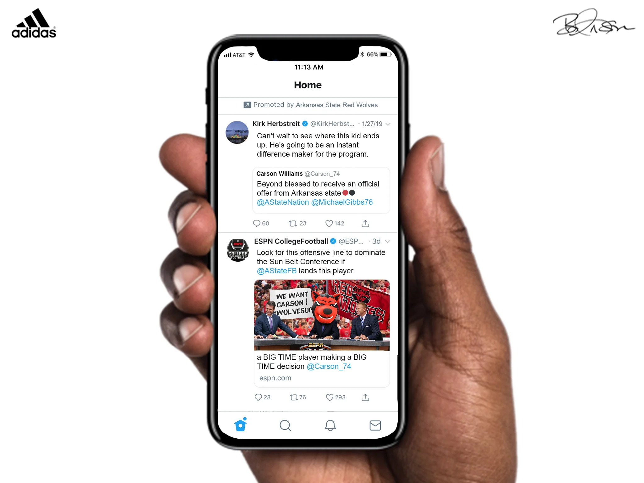
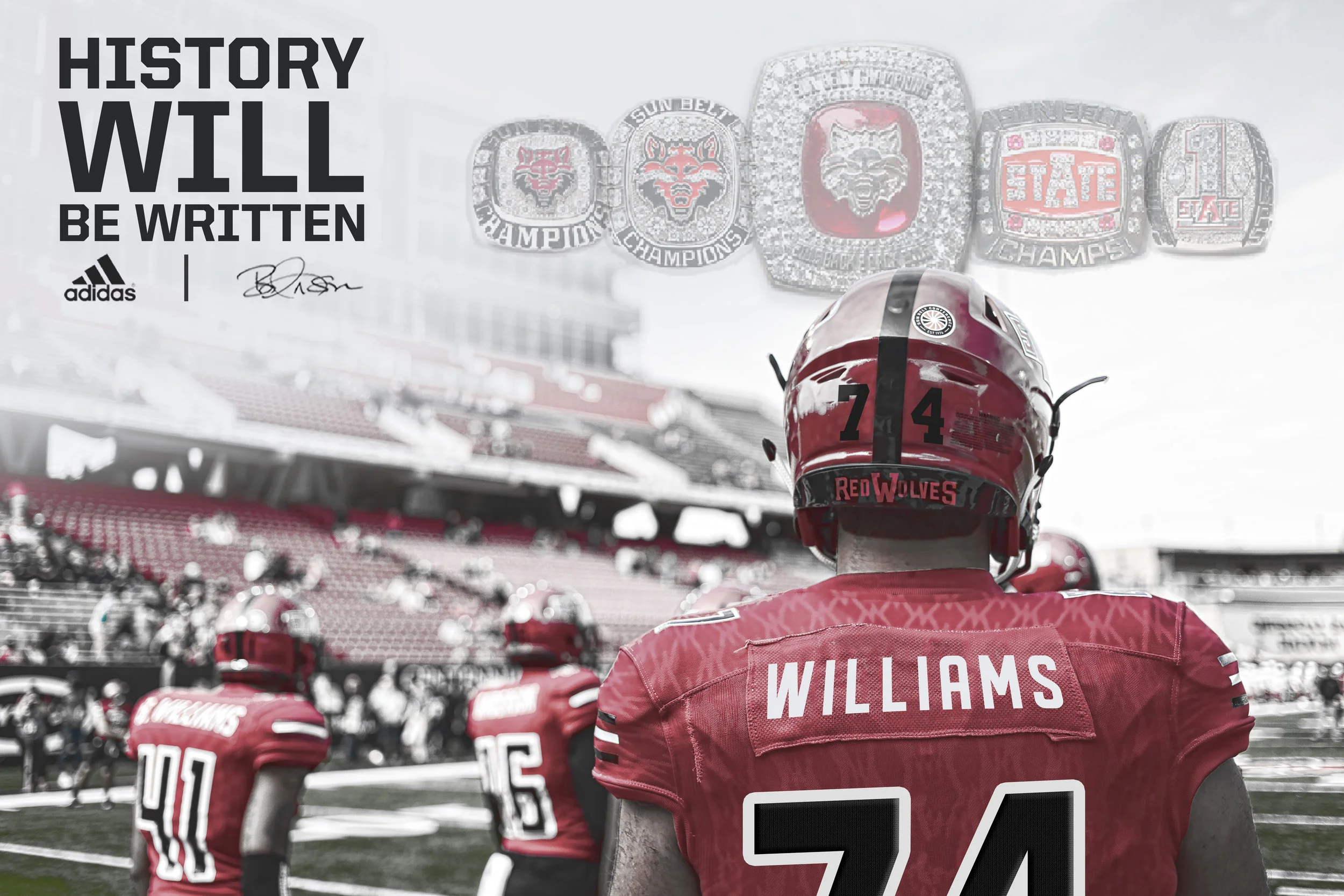
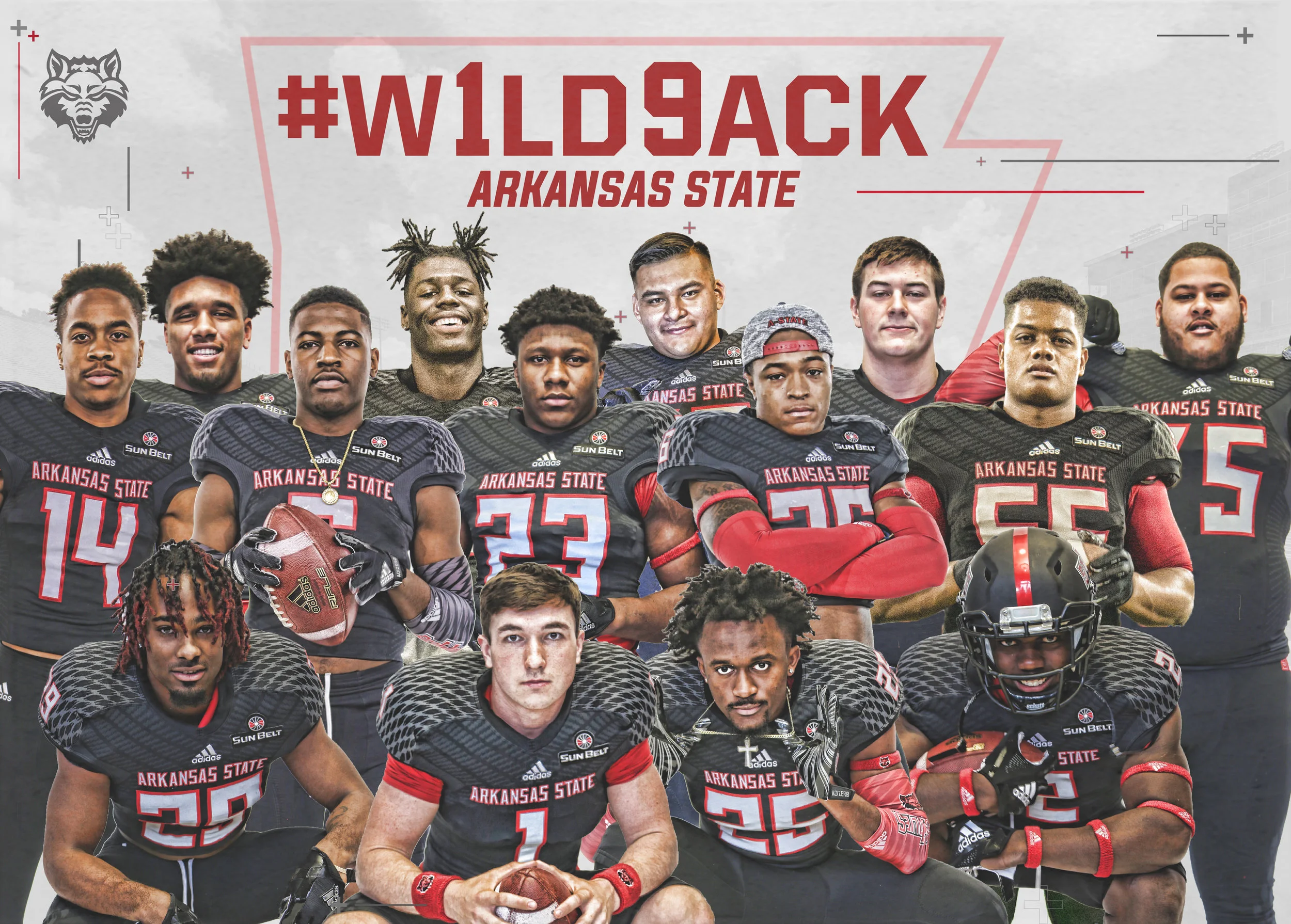
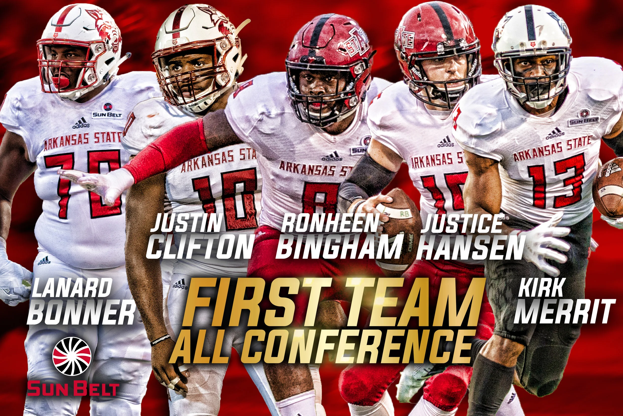
Interchangeable Custom Recruiting Graphics